| View previous topic :: View next topic |
| Author |
Message |
Elf
Joined: 24 Dec 2007
Posts: 156
|
 Posted: Sun Sep 06, 2009 3:55 pm Post subject: Need Critque on first lineart- Final image posted Posted: Sun Sep 06, 2009 3:55 pm Post subject: Need Critque on first lineart- Final image posted |
 |
|
Hi, you have all probably seen that i have an artist thread...however as it explains on the page i have been working on my first lineart to try and make it successful.
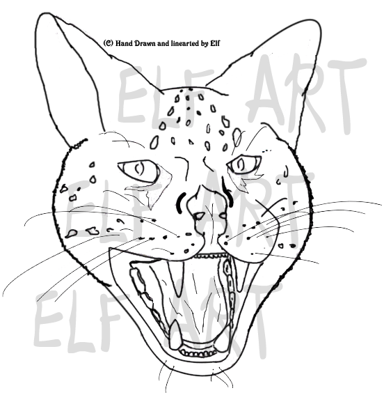
I hand drew and scanned in a wild cat ( a Serval to be precise) and lined it myself...
here is the end product (please do not steal)
the first is the original

here is the altered one:

This topic is to see what peoples response is to my artwork so that i may include it as a service on my actual art thread.
Let me know what you think of it...all views welcome.
Ta Elf 
Last edited by Elf on Fri Sep 11, 2009 12:36 pm; edited 3 times in total |
|
| Back to top |
|
 |
Cowgirls Rule
Joined: 29 Apr 2007
Posts: 10721
|
 Posted: Sun Sep 06, 2009 4:16 pm Post subject: Posted: Sun Sep 06, 2009 4:16 pm Post subject: |
 |
|
| Good, but it looks weird because it doesn't have a body. It's cute though. |
|
| Back to top |
|
 |
Ferox
Joined: 27 May 2009
Posts: 694
|
 Posted: Sun Sep 06, 2009 8:07 pm Post subject: Posted: Sun Sep 06, 2009 8:07 pm Post subject: |
 |
|
| To me, the ears look odd. Whether its because of the pose or because it's hard to do 'fluffy' with line art i'm not sure. The nose also looks not quite right, but will probably come good when coloured. |
|
| Back to top |
|
 |
Angelicious
Joined: 31 Mar 2007
Posts: 4801
|
 Posted: Sun Sep 06, 2009 8:31 pm Post subject: Posted: Sun Sep 06, 2009 8:31 pm Post subject: |
 |
|
It's really good lineart, but if it's a Serval, it should have larger, more rounded ears. Also, the spots above their eyes (just scanning through pictures on Google here) typically go up to form a triangle, not two lines. Something about the top front row of teeth doesn't seem... Cat-ish. If you know what I mean? It'll probably look more natural when (if?) it's colored in though. 
Reference images:
http://media-2.web.britannica.com/eb-media/27/9427-004-0C4754A2.jpg [full body]
http://nataly.net/wp-content/serval1.jpg [head]
I don't own either of them. |
|
| Back to top |
|
 |
Elf
Joined: 24 Dec 2007
Posts: 156
|
 Posted: Mon Sep 07, 2009 1:44 am Post subject: Posted: Mon Sep 07, 2009 1:44 am Post subject: |
 |
|
Thanx for all the comments so far...
I can see what you have all pointed out e.g the ears, markings, teeth and nose all need altered. Here is what i shall try.
Markings- changing them more to a triangular form on the forhead.
Nose- making it slightly broader to give it more body.
Teeth- lessen the amount of gum on top teeth visable.
Ears- Try to make them larger and rounder at the angle they are at the moment.
I should probably be able to make changes today to these, and ill post up an altered pic.
I do think its how the cat will be coloured that will give it the extra 3d fluffyness it truely needs.
Thanx to you guys again
Elf |
|
| Back to top |
|
 |
Elf
Joined: 24 Dec 2007
Posts: 156
|
 Posted: Tue Sep 08, 2009 1:13 pm Post subject: Posted: Tue Sep 08, 2009 1:13 pm Post subject: |
 |
|
here is the altered one:

please more comments  |
|
| Back to top |
|
 |
wolfgirl159357
Joined: 07 Aug 2009
Posts: 19967
|
 Posted: Tue Sep 08, 2009 6:21 pm Post subject: Posted: Tue Sep 08, 2009 6:21 pm Post subject: |
 |
|
i think you could work on the nose and teeth as in the k-9's  |
|
| Back to top |
|
 |
Fawn
Joined: 28 Nov 2006
Posts: 550
|
 Posted: Wed Sep 09, 2009 4:25 am Post subject: Posted: Wed Sep 09, 2009 4:25 am Post subject: |
 |
|
Also, with your lines, if you use a tablet set your pen pressure to fade, so that it looks more like strokes and less like blocked in, bluntly ending lines. If you do not use a tablet or your pen pressure is broken (like mine!) erase the tips of your lines so that they fade into points more gently. Also I find by making the place where lines meet thicker looks nicer. I'd make you an example but I dont have my tablet with me  |
|
| Back to top |
|
 |
Elf
Joined: 24 Dec 2007
Posts: 156
|
 Posted: Wed Sep 09, 2009 4:58 am Post subject: Posted: Wed Sep 09, 2009 4:58 am Post subject: |
 |
|
Thanx fawn for the tip on the pressure fade...unfortunately i don't have a tablet (its on my christmas wish list  ) but i do believe that i have pressure fade as an option anyways, i shall check. ) but i do believe that i have pressure fade as an option anyways, i shall check.
Wolfgirl- could you explain what needs to be done more on the nose and teeth, as work on is a broad comment.
Cheers to both of you.  |
|
| Back to top |
|
 |
wolfgirl159357
Joined: 07 Aug 2009
Posts: 19967
|
 Posted: Wed Sep 09, 2009 6:06 am Post subject: Posted: Wed Sep 09, 2009 6:06 am Post subject: |
 |
|
ok like make the teeyj so it looks like it is looking straight at you and not curved and with the nose could you make it a little bit wider.  |
|
| Back to top |
|
 |
Elf
Joined: 24 Dec 2007
Posts: 156
|
 Posted: Wed Sep 09, 2009 10:02 am Post subject: Posted: Wed Sep 09, 2009 10:02 am Post subject: |
 |
|
Thanks for commenting back wolfgirl...i shall make the alterations and post it up as soon as it is done.  |
|
| Back to top |
|
 |
wolfgirl159357
Joined: 07 Aug 2009
Posts: 19967
|
 Posted: Wed Sep 09, 2009 6:49 pm Post subject: Posted: Wed Sep 09, 2009 6:49 pm Post subject: |
 |
|
| ok cool and np i like being a crtique. |
|
| Back to top |
|
 |
Elf
Joined: 24 Dec 2007
Posts: 156
|
 Posted: Fri Sep 11, 2009 12:35 pm Post subject: Posted: Fri Sep 11, 2009 12:35 pm Post subject: |
 |
|
This is the final lineart:

Thanx for everyones comments and critque they were muchly appreciated.
Elf |
|
| Back to top |
|
 |
|


