| View previous topic :: View next topic |
| Author |
Message |
Des_and_Tay
Joined: 03 Jan 2007
Posts: 658
|
 Posted: Wed Jan 23, 2008 5:39 pm Post subject: Dog and Horse <---- Comments etc. Posted: Wed Jan 23, 2008 5:39 pm Post subject: Dog and Horse <---- Comments etc. |
 |
|
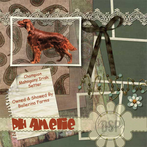
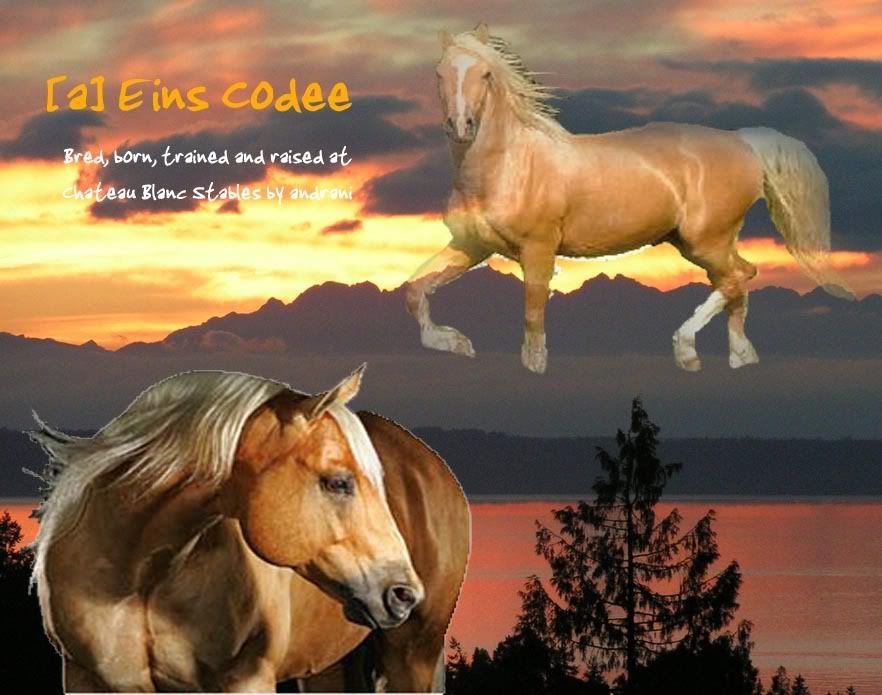
K. First few manips ever :/
Not too dandy, eh?
But whatever. First time. Best try...


For one of my VHR horses.
I will consider selling it, but only customizable for other animals here on SBF, of course  . .
-Des
P.S......feedback is much appreciated, however i have limited access to a photoshop program, and editing these may be difficult. |
|
| Back to top |
|
 |
Fiddle
Joined: 21 Jan 2008
Posts: 123
|
 Posted: Wed Jan 23, 2008 6:01 pm Post subject: Posted: Wed Jan 23, 2008 6:01 pm Post subject: |
 |
|
they look really good. I preffer the horse because it's easier to see definition than in the dog. Perhaps try to lighten the dog manip?
But they're SO good.
*wowed* |
|
| Back to top |
|
 |
Des_and_Tay
Joined: 03 Jan 2007
Posts: 658
|
 Posted: Wed Jan 23, 2008 6:14 pm Post subject: Posted: Wed Jan 23, 2008 6:14 pm Post subject: |
 |
|
| Thanks =) |
|
| Back to top |
|
 |
milon
Joined: 12 Feb 2007
Posts: 3649
|
 Posted: Wed Jan 23, 2008 6:52 pm Post subject: Posted: Wed Jan 23, 2008 6:52 pm Post subject: |
 |
|
The cutting isn't too good, but it's fairly decent for your first attempt.
I'd recommend zooming into the pictures a LOT, and erasing pixel by pixel, it's a bear, but it's worth it in the end. Also, erasing the majority of the background first, leaving a line of the background still around the horse, then zooming in and finishing up by going around the horse and cleaning it up is the best method.
I'm a huge fan of the smudge tool, which means that for the mane, tail, forelock, feathering, etc., it's a great thing - PS love. [:
I usually smudge the pelt, too, only cos I like that look and it's my style, but whatever you like. I would not advise using a strength any higher than 30, though, otherwise it'll be too smudged - but for the main hair points of your horse, dog, etc., you can use a bit stronger and also, do different sizes of brush for the mane and tail, look at a real horse and you'll see the variety of hair. If that makes any sense. ._.
Also, on the dog, I LOVE the background, but the dog looks so small in it, you need to let the dog be the more attractive of the manip - afterall, that's what it was originally for, not so much the background.
Also, play around with fonts, filters on duplicated text layer ( ctrl+j duplicates layers ) and things is also a unique touch to some pieces.
One more thing, the horse just floats. I kind of like the concept, but he's too ...sharp and pixelly, and also he's too highlighted, lower the opacity of change his layer setting to something along the lines of Hard/Soft Light, Overlay, Screen, etc.
Fiddling around is the best solution, works for all of us. x3
Thanks,
Kat |
|
| Back to top |
|
 |
Des_and_Tay
Joined: 03 Jan 2007
Posts: 658
|
 Posted: Wed Jan 23, 2008 7:13 pm Post subject: Posted: Wed Jan 23, 2008 7:13 pm Post subject: |
 |
|
Thanks, Kat =)
Your help will be greatly appreciated. |
|
| Back to top |
|
 |
SisKate
Joined: 25 Sep 2007
Posts: 1837
|
 Posted: Tue Jan 29, 2008 8:20 pm Post subject: Posted: Tue Jan 29, 2008 8:20 pm Post subject: |
 |
|
Luff them both!!!  They are so good. I could NEVER EVER do something so ah-mazing. Are you going to make more? If so, I would luff some! They are so good. I could NEVER EVER do something so ah-mazing. Are you going to make more? If so, I would luff some!
BarrelSis  |
|
| Back to top |
|
 |
|
|
You cannot post new topics in this forum
You cannot reply to topics in this forum
You cannot edit your posts in this forum
You cannot delete your posts in this forum
You cannot vote in polls in this forum
|
|
